
APN Ggantija is a neo-modernist slab serif typeface—geometric and monolinear, but with humanist traits and true italics. Its generous x-height and open apertures ensure excellent legibility in extended reading, while asserting a confident and distinctive voice in display settings.
Versatile and precise, APN Ggantija includes extensive OpenType features: small caps, ligatures, multiple figure styles, stylistic sets, alternate glyphs, fractions, mathematical symbols, and arrows. It supports a broad range of Latin-script languages, including all European languages, and is available in 16 styles as well as two variable fonts.
From Industrial Revolution to Modernism and Beyond
Slab serif typefaces first appeared in the early nineteenth century as a product of the Industrial Revolution’s growing demand for bolder letterforms to advertise the era’s new consumer goods and shifting ideas.
Roughly a century later, during the interwar period, the first revival of the Egyptians, as these faces were misleadingly called, emerged. They now generally displayed less stroke contrast and embraced a more geometric character, akin to their contemporary sans serif counterparts.
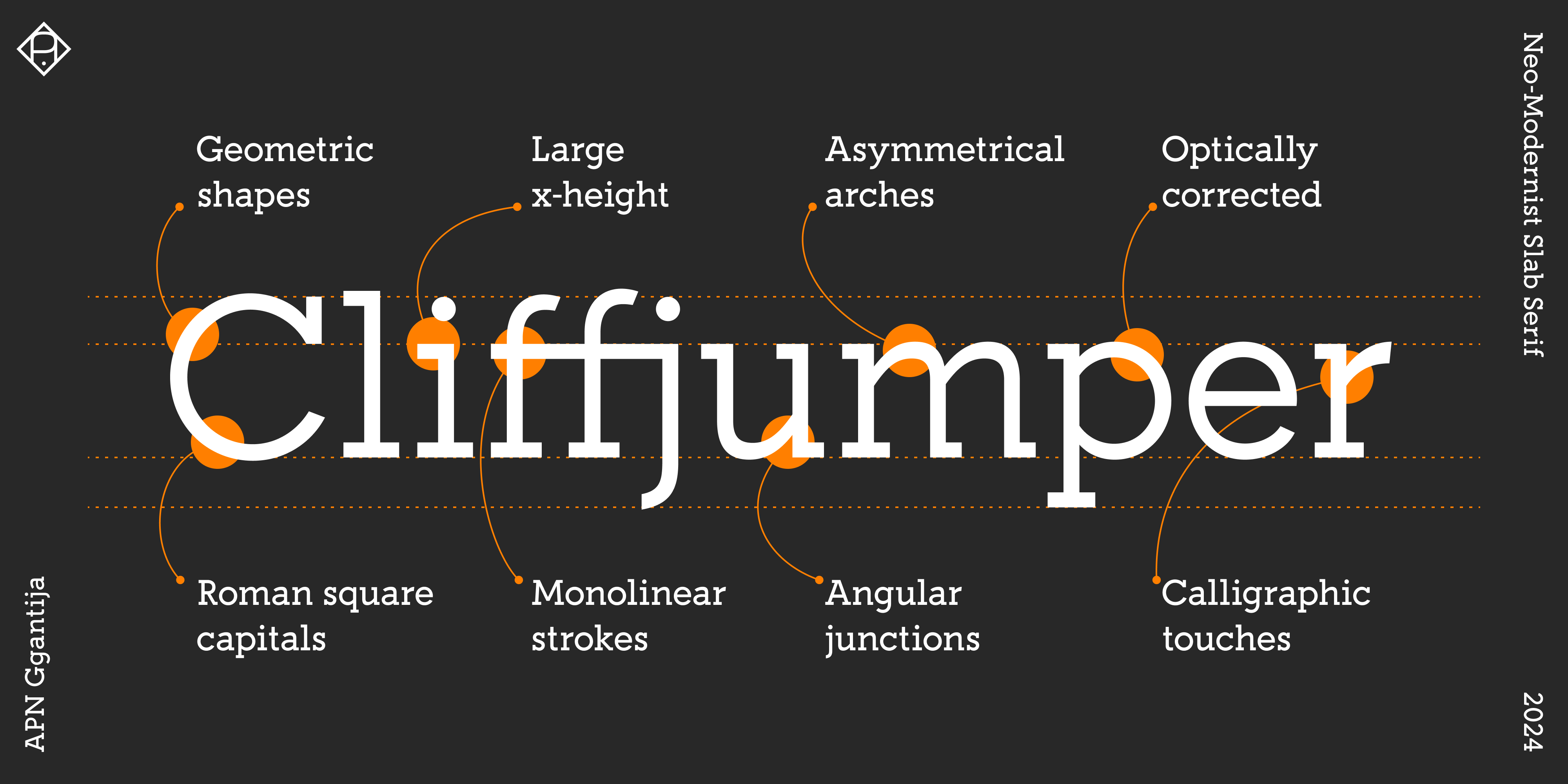
Embodying modernist ideals of clarity and functionality, these were sleek, architectural designs—austere, intentionally monolithic, and sometimes of brutalist elegance, seemingly owing more to compass and ruler than to the pen. This is the aesthetic foundation of APN Ggantija.
During the late 1960s to late 1970s, a second revival took place, when Adrian Frutiger and Herb Lubalin released their interpretations of slab serif typefaces. APN Ggantija notably inherits its relatively large x-height from this period.
However, since the model of the geometrically constructed typeface turned out to be not so functional after all, APN Ggantija also incorporates aspects from older, humanist designs—both in construction and in optional details such as the alternate double-storey “a”. These features significantly improve legibility and readability, even at surprisingly small sizes. Consequently, APN Ggantija can be used not only as a display typeface but also excels in body text settings, across genres, registers, and both analog and digital media.
Furthermore, unlike most of today’s slab serif typefaces, APN Ggantija is not simply based on a pre-existing sans retrofitted with slabs. Instead, it is purposefully drawn—built from the ground up. And unlike most older typefaces in this category, APN Ggantija includes true italics and full typographic functionality.
On the Name “Ġgantija”
I started working on APN Ggantija in the summer of 2023, during a stay on the Maltese island of Gozo, in an apartment almost within walking distance of the megalithic temple complex of the same name. These UNESCO World Heritage Site temples rank among the earliest free-standing stone buildings and among the oldest existing man-made religious structures in the world, with over 5,500 years of age, predating the Egyptian pyramids by a millennium. It wasn’t my first time on Gozo, though. I feel at home in Malta—grounded, safe, inspired. I have known it since childhood, and it is where I still go to find peace and to recharge. But beyond personal history and geographic proximity, an aesthetic connection links the typeface and the site: The temple’s façade and inner walls consist of upright limestone slabs, topped by horizontal stone blocks. When designing a typeface named like this structure, what category could be more fitting than a—quite blocky—slab serif? And then, of course, there’s the name itself, Ġgantija, the giantess: To some ears she might sound exotic (pronounced roughly “Juh-gan-tee-ya”), perhaps even more exotic than the Egyptian sites and cities the early “Egyptian” typefaces were curiously named after…
(Patrick Nell)
General Properties
- Large x-height for even text rendering, especially in languages with many uppercase letters, such as German.
- Open apertures to further improve the reading experience, particularly at smaller sizes and body text.
- Optically corrected monolinear strokes and geometric core shapes across all weights, with subtle broad-nib nuances that balance the strict geometry with humanist detail, enhancing legibility.
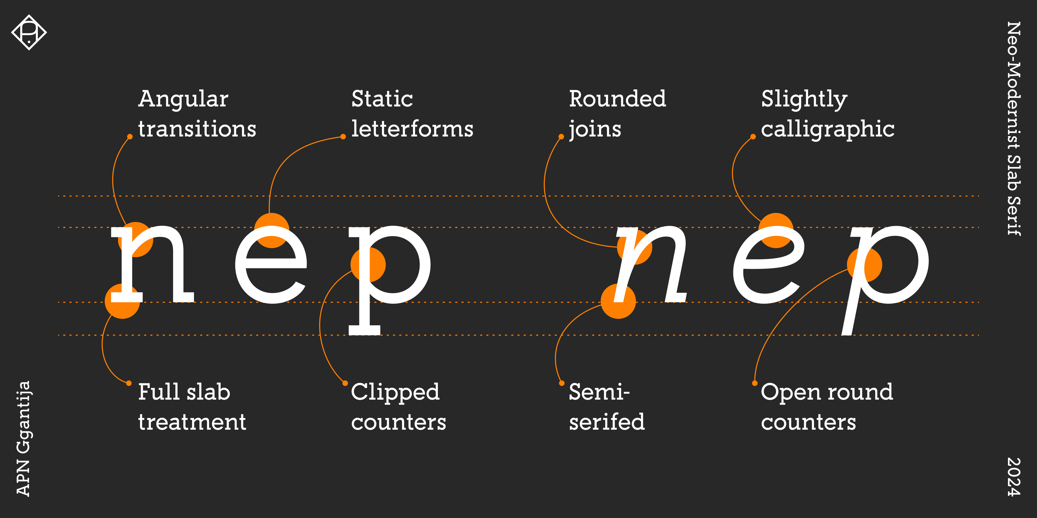
- Lowercase curves exhibit a crisp, angular transition into the stem, with asymmetrical arches, referencing an interrupted calligraphic ductus.
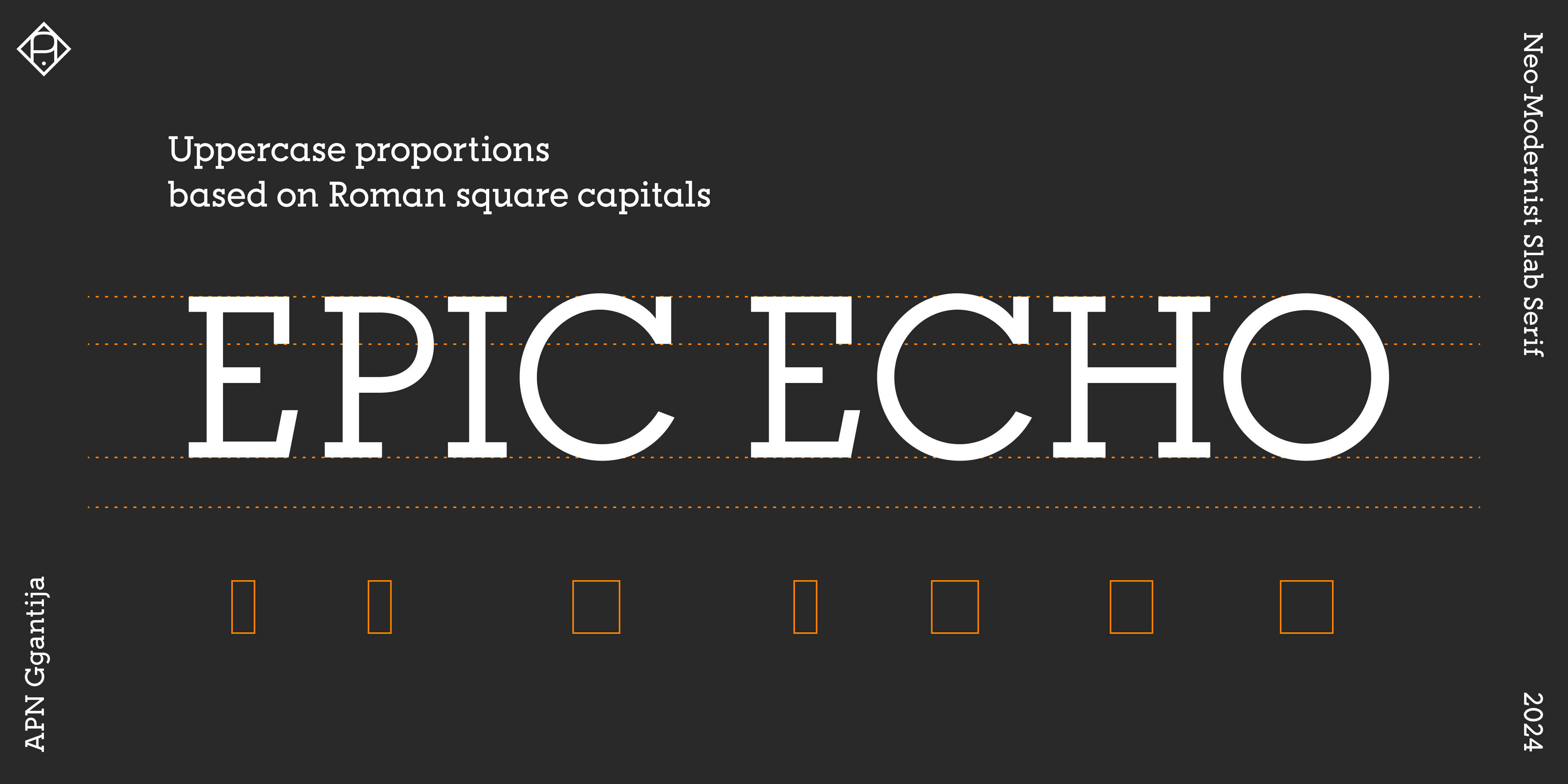
- Uppercase letters follow the variable-width model of the Roman inscriptional Capitalis Monumentalis—a trait echoed in several geometric typefaces of interbellum modernism—before such forms fell out of favor in the postwar turn toward neo-grotesque constructions.
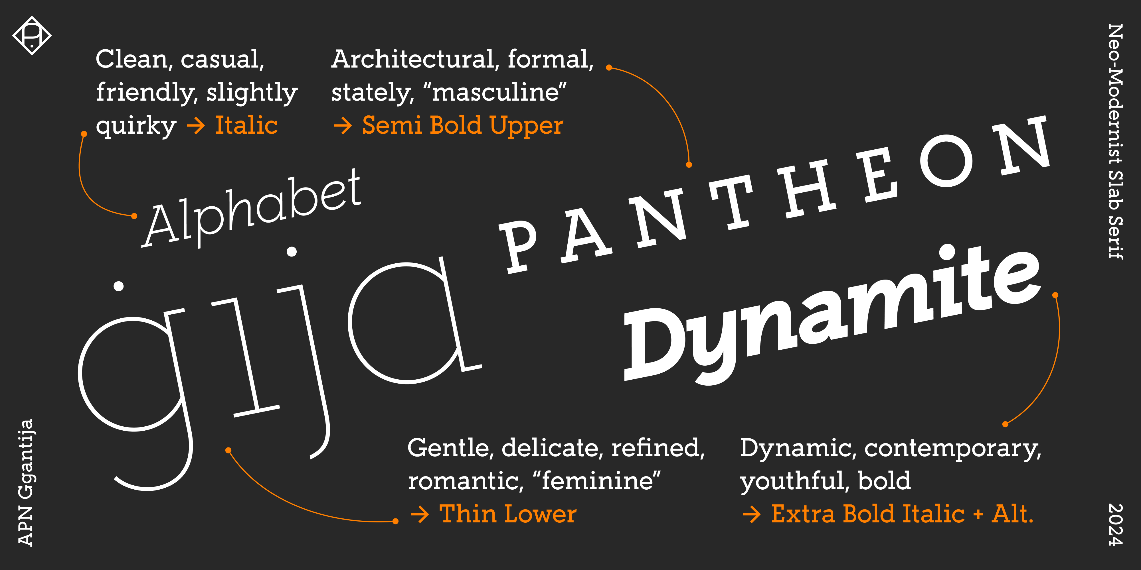
- Italics retain the full-bodied width of the roman, based on an optically perfect round “o”. This construction echoes the mechanistic, modernist tradition of slanted upright forms. Yet while APN Ggantija reflects that concept in feel, it does not follow it in fact: its true, semi-serifed italics are structurally independent, with modified shapes and a returning ductus, resulting in curved transitions and round counters. In the text weights, the italics are drawn slightly lighter to enhance typographic contrast.
- All glyphs, features, and the widths of tabular numbers (lining and old-style) are consistent across all styles.
- Display-optimized spacing in the lighter weights (tighter for large sizes), while heavier weights are spaced more generously to support use in emphasized body text.
- Weight distribution follows the Impallari progression, creating visually consistent intervals between weights and ensuring reliable bold counterparts.
Glyphs, Alternates, OpenType Features
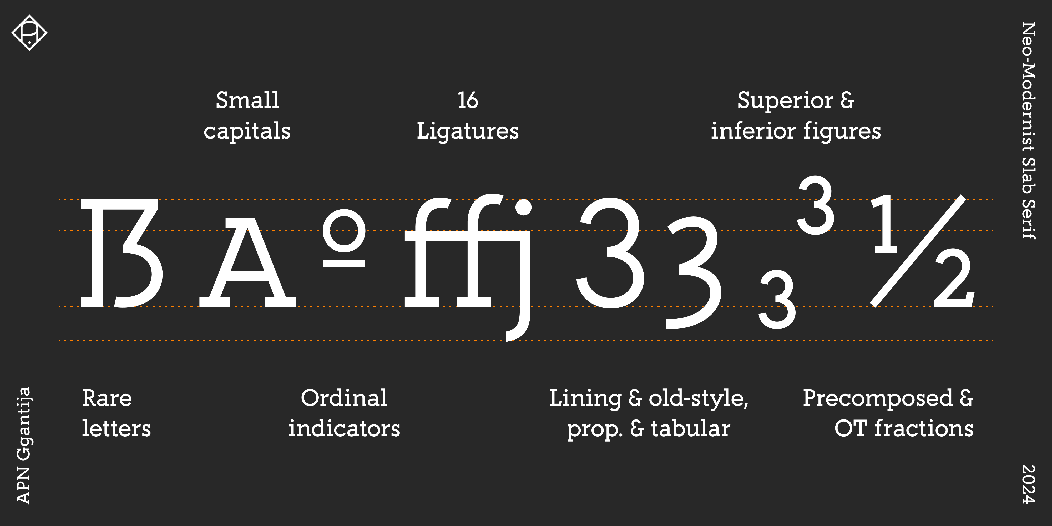
- 800+ glyphs in 16 styles.
- Multiple alternate, special, or historical glyphs, such as the uppercase sharp S (ẞ) or long s (ſ).
- Mathematical symbols.
- Arrows (discretionary ligatures—just type “->” etc.).
- Supports all European languages based on the Latin script—and many more: Afar, Afrikaans, Albanian, Aragonese, Asu, Azerbaijani, Basque, Bemba, Bena, Bosnian, Catalan, Cebuano, Chiga, Colognian, Cornish, Corsican, Croatian, Czech, Danish, Dutch, English, Estonian, Faroese, Filipino, Finnish, French, Friulian, Gaelic (Scotland), Galician, German, Greenlandic, Gusii, Hungarian, Ido, Icelandic, Indonesian, Interlingua, Interlingue, Irish, Italian, Javanese, Jju, Kabuverdianu, Kalenjin, Kinyarwanda, Kurdish, Latin, Latvian, Ligurian, Lithuanian, Lojban, Lombard, Low German, Lower Sorbian, Lule Sami, Luhya, Luo, Luxembourgish, Machame, Makhuwa, Makhuwa-Meetto, Makonde, Malagasy, Malay, Maltese, Manx, Māori, Morisyen, Northern Ndebele, Northern Sotho, Norwegian (Bokmål), Norwegian (Nynorsk), Nyanja, Nyankole, Occitan, Oromo, Polish, Portuguese, Rejang, Romani, Romansh, Rombo, Rukiga, Romanian, Rundi, Rwa, Samburu, Sango, Sangu, Sardinian, Sena, Shambala, Shona, Sidamo, Slovak, Slovenian, Soga, Somali, Spanish, Southern Ndebele, Southern Sotho, Sundanese, Swahili, Swazi, Swedish, Swiss German, Taita, Taroko, Teso, Tsonga, Tswana, Turkish, Turkmen, Upper Sorbian, Vunjo, Walloon, Warlpiri, Welsh, West Frisian, Wolastoqey, Xhosa, Zhuang, Zulu.
- Small caps, for emphasis or acronyms.
- 15 ligatures (16 in italics), including “etc.” ligature (etc).
- Case-sensitive forms.
- Ordinals.
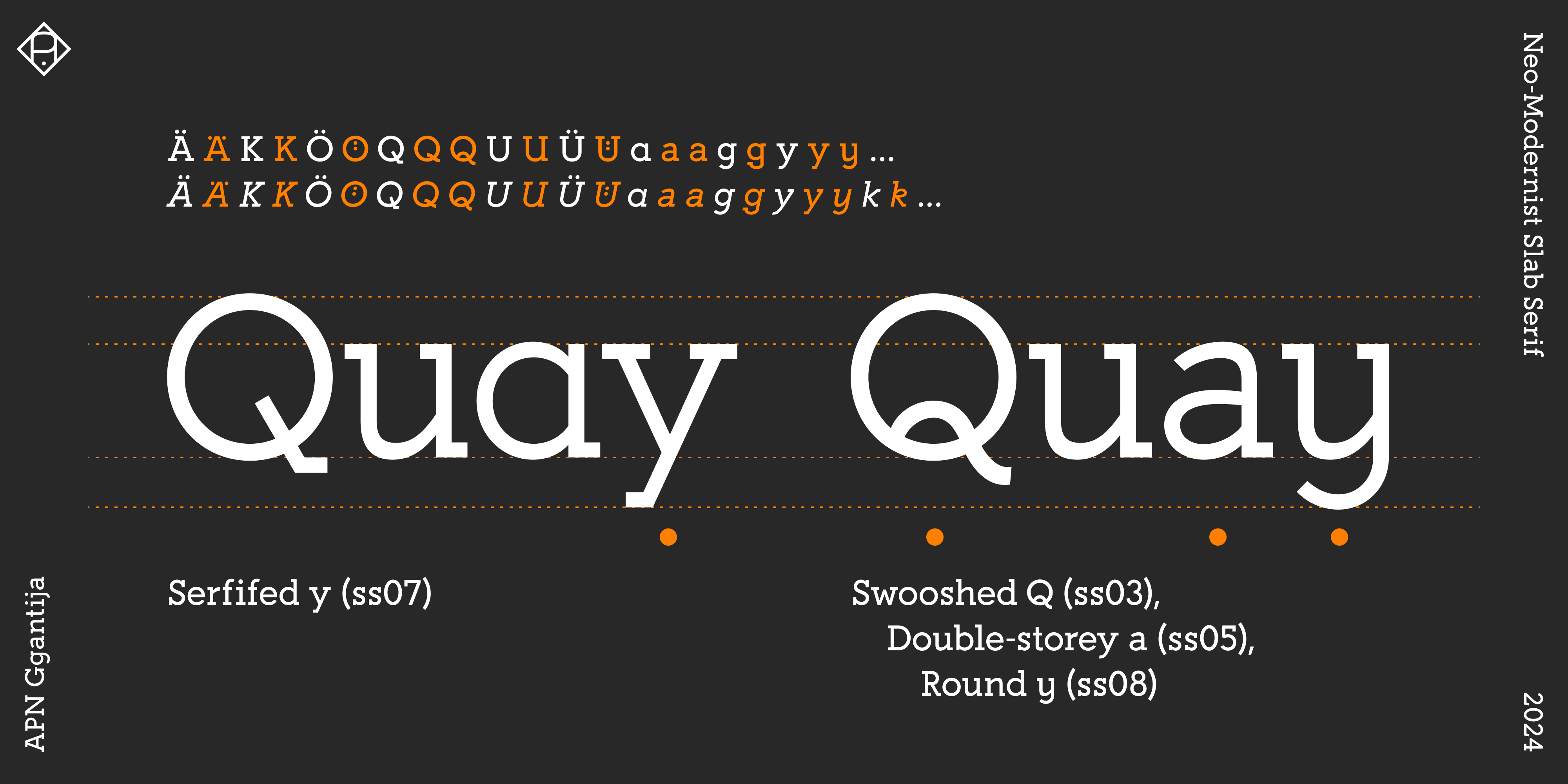
10 Stylistic Sets (with ligatures)
- K → Double-junction K (ss01)
- Q → Curvy Q (ss02)
- Q → Swooshed Q (ss03)
- U → Downstroked U (ss04)
- a → Double-storey a (ss05)
- a, g → Crooked a and g (ss06)
- y → Serifed y (ss07)
- y → Round y (ss08)
- k → Looped k (ss09, italics only)
- Ä, Ö, Ü → Ä, Ö, Ü with lowered umlaut marks for headings (ss10)
Figures
- Lining figures with static, consistent form.
- Old-style figures with dynamic, more open form.
- Tabular figures: both lining and old-style, designed for numerical data and other aligned settings, consistent across all styles, including italics.
- Superior and inferior figures: a separate set of smaller figures used for exponents and subscripts, respectively.
- Fractions: OpenType feature plus a complete set of predefined fractions for standard use.
- Dotted zeros.
Variable fonts and Web fonts (woff2) are included.
APN Ggantija is available for customization, modification, and language extensions. Please write to alphabets@alphabetspatricknell.com for more information.
