
A Humanist Display Sans with Matching Italic
It’s easy to assume that sans-serif typefaces are a recent invention. Early European printing began with blackletter, Gutenberg’s textura, and soon shifted toward the serifed types cut by the humanists of Venice in the 1470s. Only with industrialization in the early 19th century did foundries begin issuing sans-serif typefaces, while widespread use in continuous text arrived with twentieth-century modernism—at the dawn of our present era.
Yet, beyond printing types, the serif-less letter is the older model. Not only are these the letters many of us first learn in school, but they are also the ones at the very roots of our alphabet. In the Etruscan and western Greek traditions, surviving inscriptions show simple lapidary strokes rather than standardized serifs. The crisp terminals of Roman imperial capitals were codified later, often explained as the result of brush preparation before carving or of established chiseling conventions. Serif-less forms belong to the earliest layer of Western letterforms.
In this lineage, before the full scholarly revival of Roman imperial capitals took hold on the Italian peninsula, fifteenth-century Florence produced a distinct vein of sans-serif epigraphy—the Florentine inscriptions of the early-humanist Quattrocento.
The Place Before the Moment
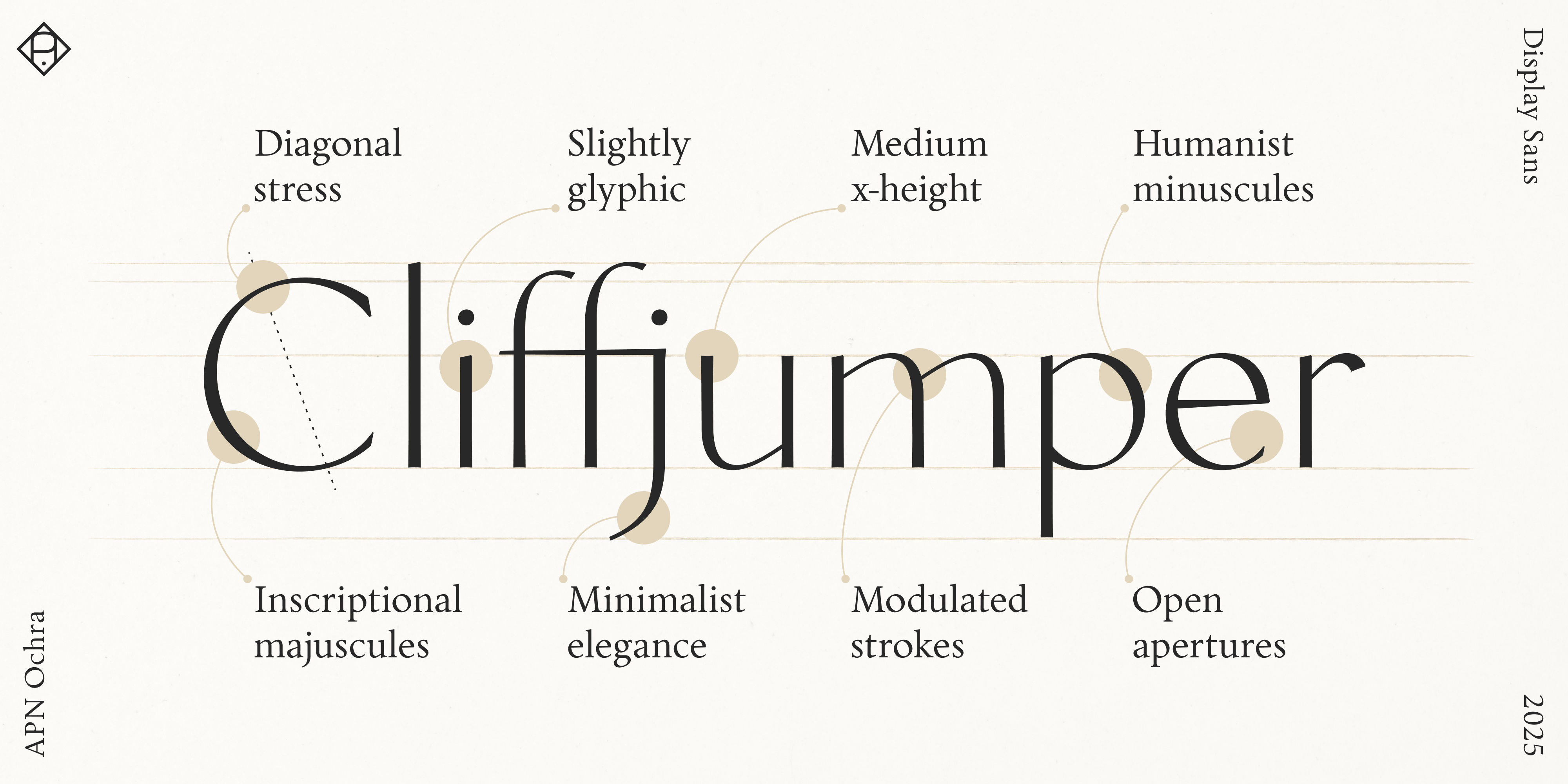
One could call APN Ochra a contemporary interpretation of a Quattrocento Florentine sans-serif, echoing slender, lightly contrasted, slightly glyphic strokes and a certain unadorned elegance of that tradition.
However, I don’t imagine APN Ochra as polished marble inscriptions on Renaissance buildings or in cool Florentine tombs. I picture it instead as dusty, sun-baked carving in rough stone—sand-worn surfaces toned from pale yellow to reddish brown, hence the name Ochra—somewhere along the Mediterranean coasts of Europe, Africa, or the Levant.
I also don’t envision APN Ochra as tied to a specific period; it speaks more to a region than to a date—an expression of place rather than time. And if it suggests natural chic—casual elegance and organic warmth—or high fashion; if it evokes the decorative functionalism of interbellum modernism or the postwar optimism of the Trente Glorieuses—that is precisely the point: these are associations, not coordinates—the typeface belongs to no single moment.
Lineage—From Chora to Ochra
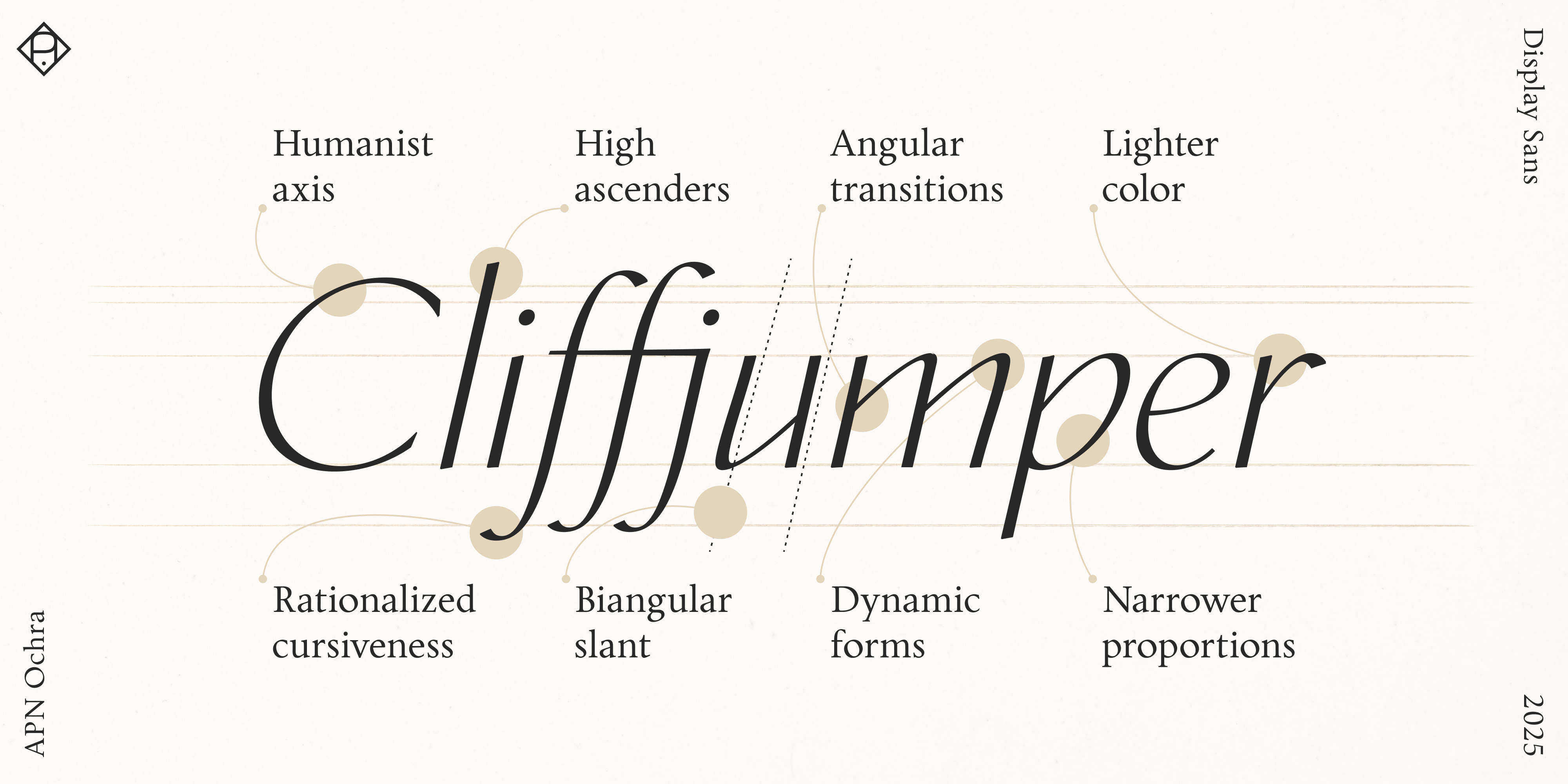
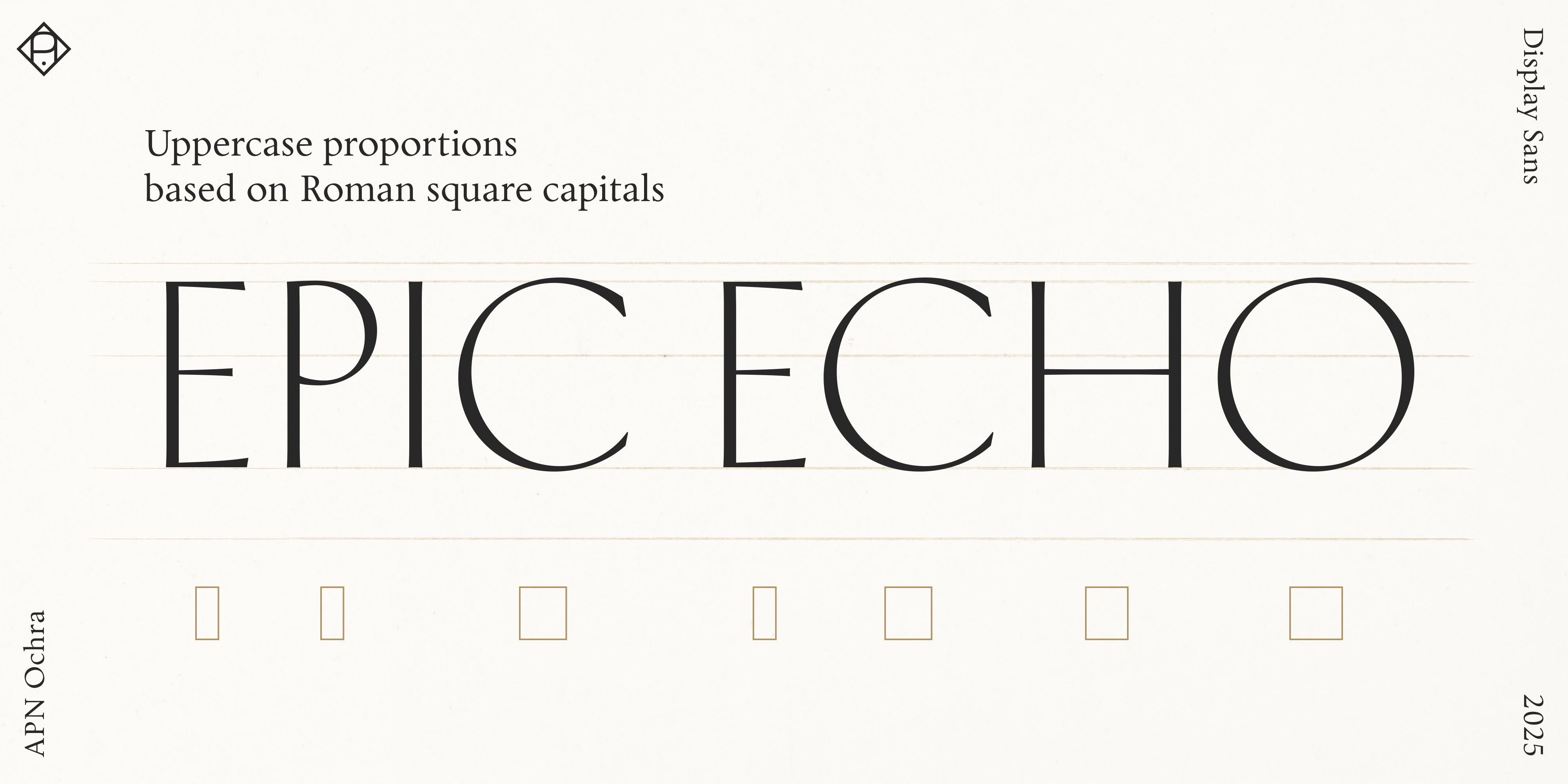
Ochra is, not by chance, an anagram of Chora. APN Ochra is a sun-tempered, expressive sans-serif titling and display companion to APN Chora. In structure and principle, APN Ochra is based on the old-style of APN Chora. It builds on its forms and aligns with many of its metrics. It preserves its pronounced twenty-degree stress and translates the logic of its serifs into terminals and finials. The tapering strokes of APN Ochra are Florentine, but the uppercase proportions are imperial Roman, while the lowercase—including the italics—follows the skeletal armature of APN Chora’s model.
The historical positioning of APN Ochra presents an intriguing paradox. Compared with its foundation, APN Chora, APN Ochra reaches further back in time in some respects. The uppercase forms seen in Florentine sans-serif inscriptions mark a transition away from medieval Romanesque habits and toward the later classical revival of Roman capitals. But they fell out of fashion around the advent of the first roman types for the press, which in turn referenced the older imperial capitals. Thus, in some respects, APN Ochra’s forms are simultaneously newer and older than those of APN Chora—an instance of typography’s cyclical revivals (for more on the recurring tide of Renaissances, see Behind the Letters: Alphabet Chora).
Stroke and Structure
APN Ochra synthesizes two lineages: Florentine sans-serif epigraphy (for tapered strokes and glyphic, slightly flared terminals) and APN Chora’s old-style, broad-nibbed logic (for calligraphic diagonal stress and lowercase forms). With its apparent thick–thin modulation, it can be classified as a humanist, stressed, or contrast sans-serif.
There are surprisingly few typefaces that walk this hybrid line. Optima by Hermann Zapf comes to mind, as does Stellar by Robert Hunter Middleton. More recent references include the Florentine Set by Paul Shaw and Garrett Boge—and, above all, Joachim Romann’s Romann-Antiqua.
APN Ochra is adjusted for titling and display use—most notably by lowering the x-height relative to APN Chora (yielding generous, graceful ascenders) and by lightening the weight significantly while maintaining contrast. APN Ochra also exhibits subtle irregularities and is slightly less rationalized than APN Chora.
Lowercase joins—where a curve meets a vertical stem—follow a uniformly interrupted rather than returning construction in both roman and italic; their arches begin on an obtuse slope and are asymmetrical, as in APN Chora. As in APN Chora, the italic uses a bi-angular inclination to impart inherent dynamism.
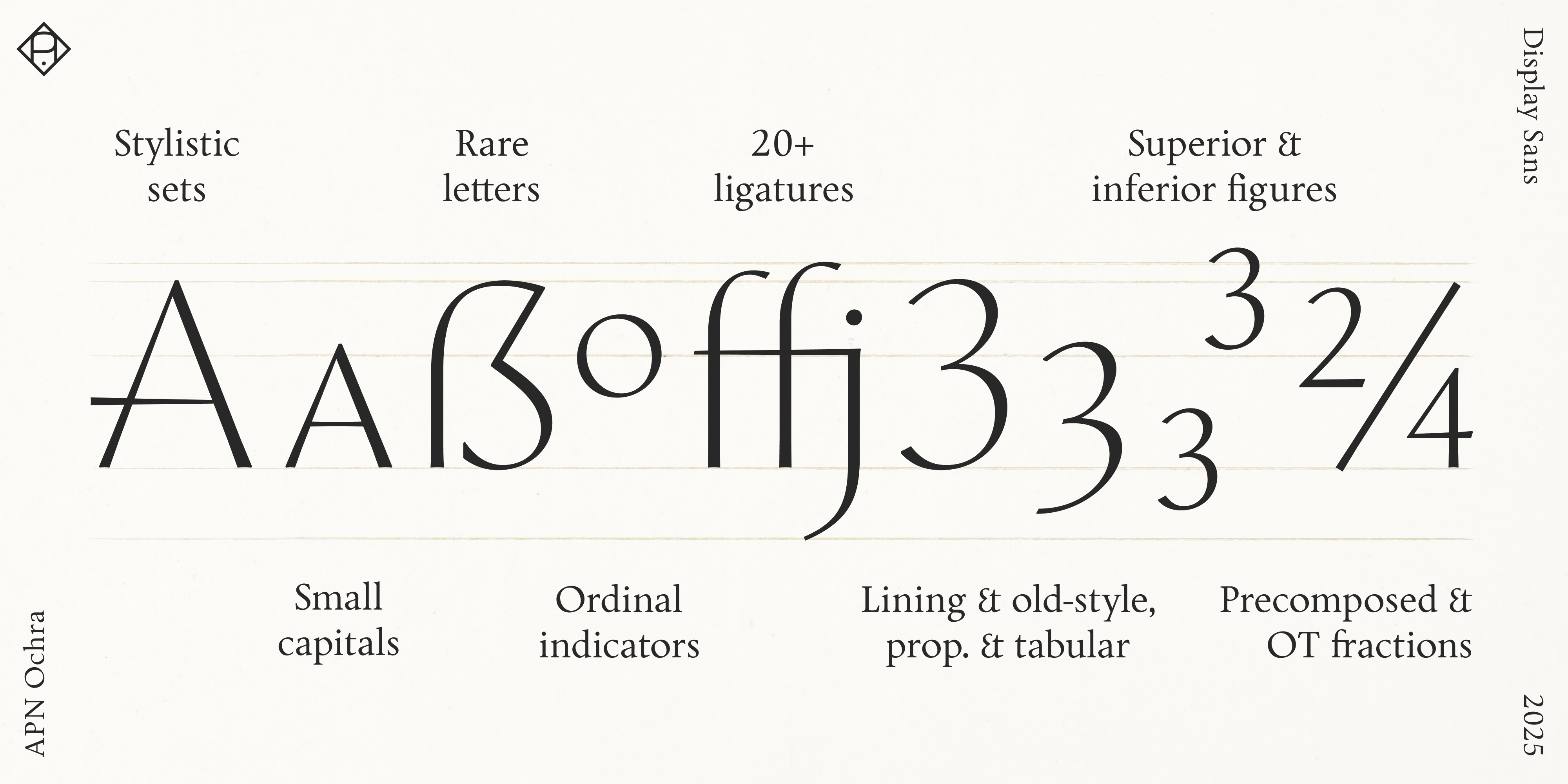
APN Ochra, although conceived for display and identity work, comes with a rich feature set. It includes lowercase and small caps, alternates, fine ligatures, case-sensitive forms, and stylistic sets—two ideal for branding, featuring extended strokes—all while offering broad language support. It also provides lining, old-style, superior, and inferior figures, fractions, and a range of symbols—mathematical, arrows, and more—everything needed for fine typography.
Why a Sans Companion?
APN Chora is intentionally spare: two essential styles—roman and italic—carry the book voice (for the rationale, see Behind the Letters: Alphabet Chora). Any companion would need to preserve what is fundamental to APN Chora: stroke modulation and a humanist diagonal stress. A monolinear sans would work against that logic.
It was equally clear that a serifed display offshoot wasn’t needed—there is no shortage of beautiful serif display faces—and that simply adding a light or bold weight to APN Chora would not serve its purpose. Historically, book typefaces were issued in a single text weight, and only later with a dedicated italic—light and bold cuts are very recent additions to the typographic palette.
Light cuts rarely hold in continuous text, and heavy weights raise their voice where APN Chora prefers to converse. So APN Ochra takes the other path: a characterful, modulated, slender-stroked sans-serif for titling, display, and branding that expands APN Chora’s range without compromising its core.
More on the Name
A coloring agent in Africa since prehistoric times, the yellow-to-red earth most widely used to coat ancient Mediterranean walls and, in the Renaissance, to paint panels and frescoes was called ochra in Latin (from ancient Greek, “pale yellow, yellow earth”) and is still called ocra in Italian today.
Coda: The Scent of a Typeface
Were APN Ochra a scent, it would be Let Me Play the Lion, composed by Isabelle Doyen for LesNez and released in 2006. Rarely has a perfume been described so aptly in its promotional material—language that might just as well describe this typeface:
Scents of dusty trails,
Of lightly sweetened ochre,
Of sun-weathered wood,
Of silence swept by mild breezes,
Of skies open like an endless azure cut oozing signs
of the coming storm.
(lesnez.com)
Key Attributes and Signature Traits
- Modulated, slightly glyphic sans-serif companion to APN Chora for titling, display, and identity work.
- Marries inscriptional traits with broad-nib logic.
- Available in two finely balanced styles: roman and italic.
- Pronounced, consistent diagonal stress carried over from APN Chora for humanist rhythm and directional flow.
- Proportions: Uppercase with imperial Roman proportions, lowercase with humanist construction.
- Lowered x-height for generous ascenders and a spare, quietly warm poise
- Lowercase curves feature an angular transition into the stem, following an interrupted stroke construction, even in the cursive forms.
- Bi-angular inclination of the italic for inherent dynamism. Lightened overall weight while maintaining contrast.
Glyphs, Alternates, OpenType Features
- 760+ glyphs in the roman, 730+ in the italic.
- Multiple alternate glyphs and special or historical glyphs like uppercase sharp S (ẞ) or long s (ſ).
- Mathematical symbols.
- Arrows are available as discretionary ligatures: type “->”, etc.
- Covers all European languages based on the Latin script—and many more, including: Afar, Afrikaans, Albanian, Aragonese, Asu, Azerbaijani, Basque, Bemba, Bena, Bosnian, Catalan, Cebuano, Chiga, Colognian, Cornish, Corsican, Croatian, Czech, Danish, Dutch, English, Estonian, Faroese, Filipino, Finnish, French, Friulian, Gaelic (Scotland), Galician, German, Greenlandic, Gusii, Hungarian, Ido, Icelandic, Indonesian, Interlingua, Interlingue, Irish, Italian, Javanese, Jju, Kabuverdianu, Kalenjin, Kinyarwanda, Kurdish, Latin, Latvian, Ligurian, Lithuanian, Lojban, Lombard, Low German, Lower Sorbian, Lule Sami, Luhya, Luo, Luxembourgish, Machame, Makhuwa, Makhuwa-Meetto, Makonde, Malagasy, Malay, Maltese, Manx, Māori, Morisyen, Northern Ndebele, Northern Sotho, Norwegian (Bokmål), Norwegian (Nynorsk), Nyanja, Nyankole, Occitan, Oromo, Polish, Portuguese, Rejang, Romani, Romansh, Rombo, Rukiga, Romanian, Rundi, Rwa, Samburu, Sango, Sangu, Sardinian, Sena, Shambala, Shona, Sidamo, Slovak, Slovenian, Soga, Somali, Spanish, Southern Ndebele, Southern Sotho, Sundanese, Swahili, Swazi, Swedish, Swiss German, Taita, Taroko, Teso, Tsonga, Tswana, Turkish, Turkmen, Upper Sorbian, Vunjo, Walloon, Warlpiri, Welsh, West Frisian, Wolastoqey, Xhosa, Zhuang, Zulu.
- Small caps, for emphasis or acronyms.
- 22 ligatures.
- Case-sensitive forms.
- Ordinals.
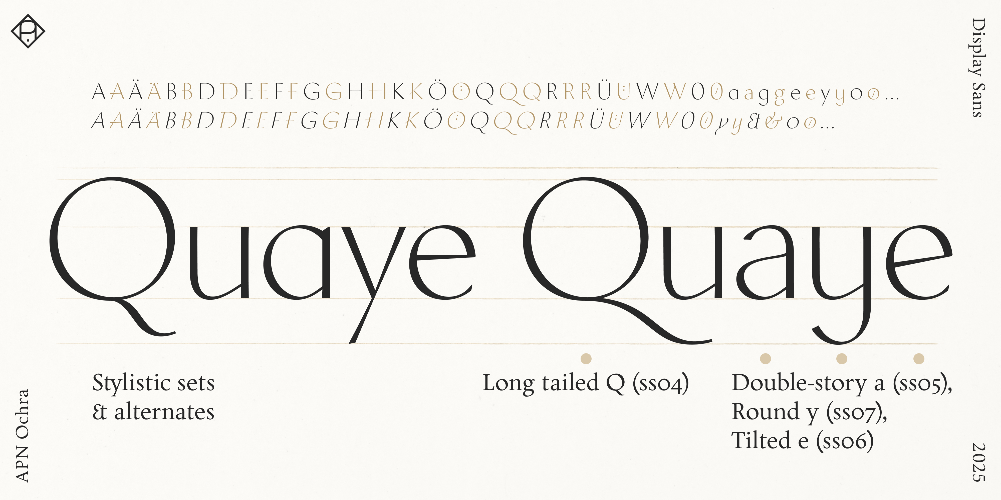
Stylistic Sets (with Ligatures) and Character Variants
- ss01: Ä, Ö, Ü with lowered umlaut marks tight headings.
- ss02: Extended uppercase strokes.
- ss03: K and R with extended arm/leg.
- ss04: Long tailed Q.
- ss05: Double-story a and g (roman only).
- ss06 Tilted e (roman only) and hyphen.
- ss07: Round y.
- cv01: Roman centered period.
- cv02: Calligraphic ampersand (italic only).
- cv03: Double-storey ornament.
Figures
- Lining figures.
- Old-style figures.
- Tabular figures: Both lining and old-style figures are available in a tabular format, specifically designed for tables and data presentation, consistent across both styles.
- Superior and inferior figures: A separate set of smaller figures used for exponents and subscripts, respectively.
- Fractions: OpenType feature plus an exhaustive selection of predefined fractions for most use cases. Slashed zeros.
Web fonts (woff2) are included.
APN Ochra can be readily customized, modified, and extended for additional languagess. Please write to alphabets@alphabetspatricknell.com for more information.
