Serif · Aldine · 12 Styles / 2 VF
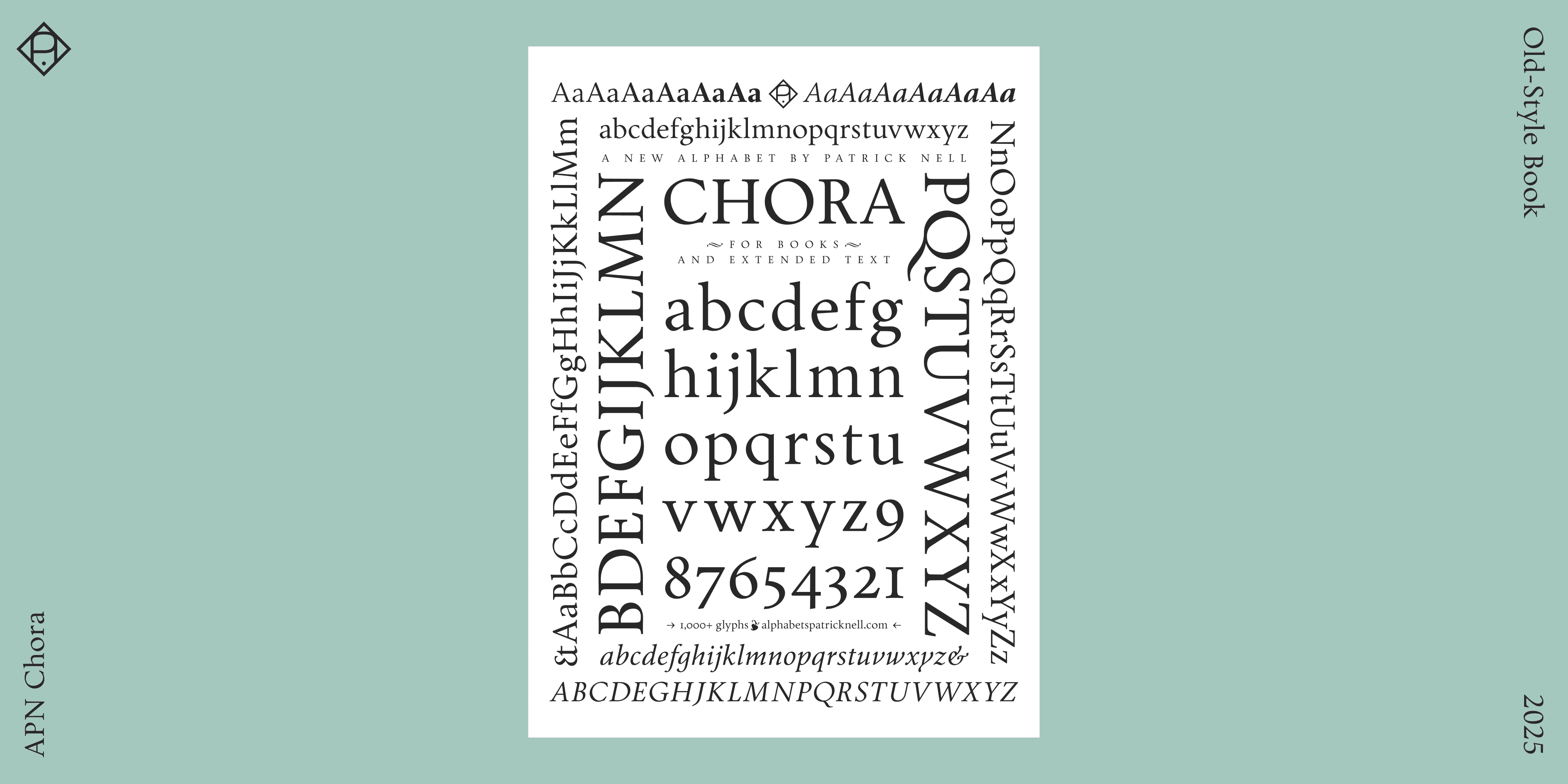
APN Chora is a contemporary old-style typeface, crafted for optimal legibility in books and editorial design, as well as for extended reading on screens.
Available in Roman and Italic, each in six weights from Light to Extra Bold, plus variable fonts, it is fully equipped for the demands of refined typography. APN Chora’s extensive feature set includes small caps, ligatures, multiple figure and stylistic sets, alternate glyphs, fractions, mathematical and musical symbols, arrows, and a selection of ornaments. It supports all European languages written in the Latin script, as well as many others. With its rationalized Renaissance construction, the typeface features a pronounced humanist axis, a generous x-height, and medium stroke contrast for an even typographic color. While optimized for continuous text, its austere elegance also suits display applications. APN Chora embodies the elegance, legibility, and readability that define the finest old-style typefaces.
Also available: APN Ochra, a slender, sun-baked sans-serif display and titling companion to APN Chora, with a subtle glyphic touch and a nod to the earlier Quattrocento Florentine letterforms, further illustrating the cyclical nature of typographic and cultural revivals.
A Contemporary Renaissance Old-Style Typeface for Extended Reading
Old-style typefaces are among typography’s oldest designs, yet they remain unrivaled for text legibility.
Around 1470, shortly after Gutenberg’s invention of the protoindustrial printing press using movable type, a number of pioneering printers and typographers gathered in Venice, rejected the dense, dark blackletter script, and instead enthusiastically embraced the timeless grandeur of the Roman imperial inscriptions—the ancient capitalis monumentalis.
Alongside it, they placed an alphabet of uncluttered, round lowercase letters based on the handwriting used by early humanist scholars, thus combining the two, adapting the latter to the former with a few clever adjustments. In doing so, they laid the foundation for what we now take for granted and, in the best sense, read past. These so-called old-style typefaces are so legible and effective that, for all their undeniable beauty and grace, they are able to recede behind the text.
The Modernist Gesture
APN Chora is an abstract translation of Renaissance typefaces rather than a facsimile revival or literal transcription of humanist letterforms. Its calligraphic origins are mostly implicit, not rendered through extroverted stroke effects, uneven color, or digitally simulated irregularities.
More specifically, APN Chora is a Renaissance roman seen through the lens of twentieth-century book typography—its closest relatives are not Jenson’s punches, but the revivals of the modern era that rediscovered them, from Centaur and Bembo to Berling and Amalthea.
These were not modernist typefaces on a formal level; they were not modernist in the avant-garde sense—the first of these revivals were inspired by the Arts and Crafts movement, after all. Yet they do belong to the classical wing of the modern movement that understood Renaissance romans as an origin point: simple, rational, and well-proportioned, free from what was perceived as nineteenth-century fuss.
In other words, the gesture itself is distinctly modernist: to purge the clutter, return to essentials, and base the design on a historically tested, rational model. Compared to Victorian excess, these designs appeared positively austere. So, on an ideological and methodological level, the project is strongly modern; it is functional, systematic, and often conceived as an industrial system, drawn for twentieth-century demands.
APN Chora is inspired by this typographic heritage—without directly referencing any single historical model. It is a contemporary humanist roman with an accompanying italic, capturing Venetian, Aldine, and Dutch characteristics; it carries a twentieth-century sensibility, yet it is fully informed by today’s perspective, using today’s tools for today’s demands. It is the kind of neo-humanist typeface that Robert Bringhurst might call lyrical modernist.


The Chorus: Recurring Cycles of Form
A leitmotiv in the development of APN Chora was the idea of the cyclical, the recurring—the chorus.
The Renaissance reflected on ancient forms and ideals, and these classical ideals were later revisited and reinterpreted by movements such as Neoclassicism and Historicism with its Neo-Renaissance styles, and the classical undercurrents of twentieth-century modernism, often with blurred transitions between them—a phenomenon particularly evident to a Viennese type designer through the surrounding architecture of the city.
Interestingly, the Renaissance itself wasn’t the first such revival; its humanist minuscule, for instance, found its direct inspiration in the Carolingian minuscule. The humanists mistakenly believed this script to be genuinely ancient, leading them to call their adaptation the littera antiqua. In reality, the script had been developed only a few centuries earlier during the Carolingian Renaissance—itself one of several smaller-scale medieval renaissances that also looked back to antiquity.
APN Chora is conceived as an imagined Renaissance typeface, one that could only have been envisioned through the lens of these recurring cycles of influence, so prevalent in both type design and the broader history of art.

A Book Typeface
APN Chora began under the working title Wiener Buchschrift, or Viennese Book Typeface.
But what kind of book would that have been? There are magnificently designed books that are loud, bold, diverse, or rely on disruption. Just as this approach has its place, so does the quiet radiance of reduced design: the thoughtful use of a single humanist typeface, plus an italic, with not too many text sizes, relying instead on clear hierarchies and the employment of sufficient whitespace to let the text breathe. Typographic contrast would be achieved through the skillful use of the italic, small caps, and, for titling, the inscriptional capitals, with their distinctive Trajanic rhythm of narrow and wide letters—and a beautifully round O.
APN Chora embodies this second, restrained approach especially well. But unlike many of its historical inspirations, which come only as a roman (and possibly an italic), APN Chora offers a broad spectrum of weights, from Light to Extra Bold, for maximum typographic flexibility.
Furthermore, APN Chora is generously equipped, containing everything necessary for sophisticated typography: in addition to small capitals, it features a fine selection of rare ligatures, multiple numeral and stylistic sets, alternate and historical glyphs, fractions, mathematical and musical symbols, arrows, and extensive OpenType features. It supports a wide range of languages, including all European languages using the Latin script.
Among its stylistic sets and alternate forms are variants that allow for different flavors and applications. There are capitals with increased width for when Imperial Roman proportions don’t suit the context. An alternate e with an angled crossbar recalls the Venetian origins of old-style forms, while an M in the style of Francesco Griffo, distinguished by its single upper serif, references the Aldine tradition.


A Matter of Character
APN Chora aims to balance two ideals: to be the most legible of elegant typefaces and the most elegant of legible typefaces. Optimized for continuous reading in long-form text, it prioritizes comfort with an even, adequately dark color and clear, open letterforms. Both on paper and on screen, the design remains free from flickering or dazzle—the distracting visual effect caused by extreme stroke contrast.
As a model of restraint, APN Chora is refined without becoming fancy or flamboyant. To quote Stanley Morison in First Principles of Typography, it remains “free from faddishness and frivolity.” While it carries the characteristic warmth of old-style faces, it never overindulges. It is austere, sober, and stately, with a distinguished, understated elegance. Superfluous decoration is stripped away—save for an alternate Q with a gracefully long tail.
Designed primarily as a book typeface, APN Chora’s inherent qualities shine at larger sizes. Used to great effect as a display face, its character and crisp detailing reveal themselves beautifully.
It is an ideal choice for classical, unadorned typography, effortlessly providing precision with personality and clarity with character.


Stroke and Structure
APN Chora features a pronounced humanist axis, informed by the logic of broad-nib construction. This angled stress imparts a directional dynamism that guides the eye more effectively than the rigidity of later vertical-axis models. In APN Chora, the diagonal stress decreases as the weight increases—from a pronounced 20 degrees in the Regular to 10 degrees in the Bold—yet remains consistent between the Roman and the Italic. This fulfills the italic’s twofold purpose: differentiating layers of information while remaining an integral part of the text.
The Italic, with its cursive design, provides an animated texture that contrasts well with the more austere Roman. It is characterized by bi-angular lowercase forms, as in the stems of the n, and by the optical impression of steeper angles in letters such as f and flatter ones in letters such as i—an effect created by their length and calligraphic treatment—resulting in an active yet controlled rhythm. The Italic also features a few particularly personal letterforms, such as the twisted y and the open-tailed g. Like the Roman, the Italic is fully featured, with small capitals, numerous stylistic sets, alternate glyphs, and tabular figures whose widths remain identical across both styles and throughout all weights.
APN Chora employs a substantial x-height to enhance legibility while preserving the long ascenders of early Renaissance types, lending distinction on both the printed page and the screen. The lowercase curves resolve in crisp, angular transitions into the stem and form asymmetrical arches. This underlying ductus, or stroke construction, is interrupted rather than returning, even in the cursive forms—not only reflecting a personal preference but, in its very consistency, also nodding to twentieth-century tendencies and modernist thinking. Furthermore, APN Chora selectively acknowledges later typographic developments through details such as subtly beaked terminals on certain lowercase letters—for example, the g, whose beak replaces the traditional horizontal tail—as well as the symmetrical top serifs of the T, characteristic of Transitional types, and the alternate R with its eighteenth-century leg.
APN Chora demonstrates a medium contrast between thin and thick strokes, with subtle modulation creating more even color than in typefaces grounded in later traditions. The progression of stroke thickness from Regular to Bold follows the Golden Ratio, while the distribution of weights follows the Impallari Progression, creating harmonious visual intervals. Overall stroke contrast increases alongside weight, resulting in a spiky, low-contrast Light and a high-contrast Extra Bold.
While APN Chora displays a high degree of geometric regularity, it is drawn with grace and possesses enough peculiarities and idiosyncrasies to keep it alive and interesting. Its capitals maintain the distinctive classical proportions and rhythm of narrow and wide letters, with a sculpted round O and bracketed serifs that give them a column-like appearance, while the full-bodied minuscules—with generous counters and round, open forms topped with calligraphic head serifs—bring ease and pleasure to reading.
APN Chora is neither a revival nor a true hybrid. It is a rationalized Old-Style that preserves the elegance, warmth, and structural logic of Renaissance typography while quietly absorbing the lessons of the centuries that followed.


What’s in a Name?
Chora initially suggests the idea of repetition and variation found in the chorus—be it in art movements or, more directly, in the design of letterforms.
A typeface truly succeeds when it achieves a harmonious balance between overall visual coherence and the character of its individual letters—or, as Giambattista Bodoni wrote in his Manuale Tipografico (1818), when it achieves “conformity without ambiguity, variety without dissonance.”
However, there is another layer of meaning. Chora carries deeper significance that resonates with a typeface designed for the contemplative act of reading: in Platonic philosophy, chōra represents neither being nor non-being, but rather a receptacle or space where ideas materialize into form—a concept well aligned with typography itself. Like the Platonic chōra, a typeface can be seen as a vessel that renders abstract thought tangible and the immaterial visible.
This second dimension connects chora to the Renaissance, a period of intellectual and artistic rebirth when scholars and artists looked back to Ancient Greece and Rome for inspiration. The typefaces of the Renaissance were ultimately rooted in the Greco-Latin script and the rationality and clarity of classical ideals. APN Chora draws on this intellectual tradition, serving as a medium through which ideas can take form—a fitting role for a typeface designed to facilitate clear and elegant communication in books and long-form texts.
And in the end, it’s simply a pleasant, short, and sweet name for a typeface.
Key Attributes and Signature Traits
Six weights each in Roman and Italic, from Light to Extra Bold, plus variable fonts.
Designed for optimal legibility in extended reading, in print or on screen.
Rationalized Renaissance construction: humanist minuscules, Roman inscriptional majuscules, and dynamic italic forms.
Pronounced and consistent humanist axis, referencing the broad-edged calligraphic pen.
Lowercase curves meet the stems in angular transitions that follow an interrupted stroke construction, even in italic forms, keeping counters open at caption sizes while adding structural detail at display sizes.
The italic’s bi-angular construction creates an active yet controlled rhythm.
Medium stroke contrast for an even typographic color.
Generous x-height for more even text rendering, especially in languages with many uppercase letters, such as German.
Open apertures to further improve the reading experience.
Glyphs, Alternates, OpenType Features
1,000+ glyphs.
Multiple alternate letters and symbols, plus special and historical glyphs such as uppercase sharp ẞ or long ſ.
A set of alternate ampersands for both Roman and Italic.
Small caps, also in Italic styles, for emphasis or acronyms.
30+ ligatures, both standard and discretionary.
Arrows, also available through discretionary ligatures: simply type “->” etc.
Case-sensitive forms.
Ordinals.
Mathematical and musical symbols.
A collection of ornaments and dividers, including floral heart, Maltese cross, cross pattée, single flourish, and double flourish.
Covers all European languages based on the Latin script, plus numerous languages across Africa, Asia, Oceania, and the Americas, including: Afar, Afrikaans, Albanian, Aragonese, Asu, Azerbaijani, Basque, Bemba, Bena, Bosnian, Catalan, Cebuano, Chiga, Colognian, Cornish, Corsican, Croatian, Czech, Danish, Dutch, Embu, English, Estonian, Faroese, Filipino, Finnish, French, Friulian, Gaelic/Scotland, Galician, German, Greenlandic, Gusii, Haitian Creole Hawaiian, Hungarian, Ido, Icelandic, Indonesian, Interlingua, Interlingue, Irish, Iskonawa, Italian, Javanese, Jju, Kabuverdianu, Kaingang, Kalenjin, Kamba, Kinyarwanda, Kikuyu, Kurdish, Latin, Latvian, Ligurian, Lithuanian, Lojban, Lombard, Low German, Lower Sorbian, Lule Sami, Luhya, Luo, Luxembourgish, Machame, Makhuwa, Makhuwa/Meetto, Makonde, Malagasy, Malay, Maltese, Manx, Māori, Meru, Morisyen, North. Ndebele, North. Sotho, Norwegian/Bokmål, Norwegian/Nynorsk, Nyanja, Nyankole, Occitan, Oromo, Polish, Portuguese, Rejang, Romani, Romansh, Rombo, Rukiga, Romanian, Rundi, Rwa, Saho, Samburu, Samoan, Sango, Sangu, Sardinian, Serbian, Sena, Shambala, Shipibo, Shona, Sidamo, Slovak, Slovenian, Soga, Somali, Spanish, South. Ndebele, South. Sami, South. Sotho, Sundanese, Swahili, Swazi, Swedish, Swiss German, Taita, Taroko, Teso, Tongan, Tsonga, Tswana, Turkish, Turkmen, Upper Sorbian, Volapük, Vunjo, Walloon, Walser, Warlpiri, Welsh, West Frisian, Wolastoqey, Xhosa, Zhuang, Zulu.
Stylistic Sets (with Ligatures) and Character Variants
ss01: Ä, Ö, Ü with lowered diacritic marks.
ss02: Stemmed A/Ä and U/Ü.
ss03: Wide E, F, and L.
ss04: Square H, N, and U.
ss05: Curved-leg K and R, long-tailed Q.
ss06: Griffo-style M (single upper serif).
ss07: Kinetic T (Italic styles only).
ss08: Single-story a and g (Roman styles only).
ss09: Venetian e (angled crossbar, Roman styles only) and angled hyphen.
ss10: Round y.
ss11: Standard-form ampersand.
ss15: Enable Th and tt (house ligatures).
ss16: Narrow f.
Figures
Lining figures.
Old-style figures.
Both lining and old-style figures are available in tabular form, with consistent widths across all weights and styles.
Superior and inferior figures for exponents and scientific subscripts.
OpenType fractions plus an exhaustive selection of predefined fractions.
Optional slashed zeros.
Web fonts (woff2) are included.
APN Chora is available for customization, modification, and language extensions. Please write to alphabets@alphabetspatricknell.com for more information.